Dramatic Film / Lighting:
Lighting in films can create an emotional impact. A primordial response to darkness and light is a deep sealed element of human psychology that film makers have harnessed in oder to influence the way viewers respond to narrative development.
|
|
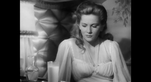
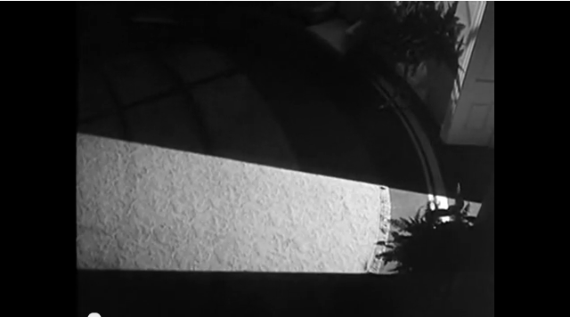
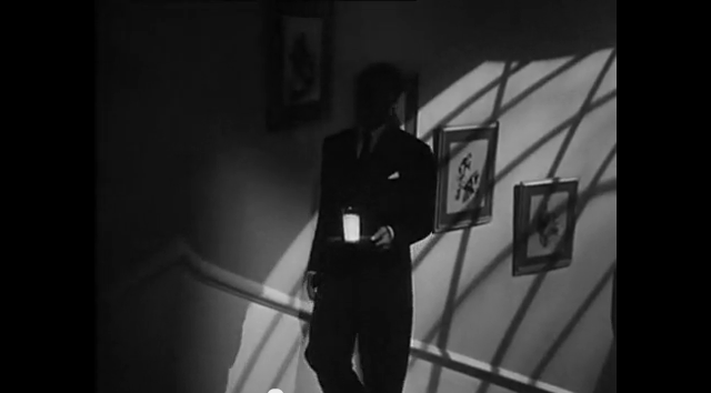
We looked at this scene from Alfred Hitchcock's film Suspicion from 1941. We specifically looked at this, for the choice of lighting which was used in this one particular scene. I watched this scene independently and look more into the choice of lighting, and how effective it was in this scene. I really liked the way it first starts with the young woman in bed, presumingly she's fallen ill and the gentleman comes to give her a glass of milk. When we first see the man, we see a black space, and then we see a shadow of a door being opened. Then we gradually see the mans shadow which seems to have a sinister feel and is quite uneasy looking. When the man turns off the light, or closes the door we see a shadow of a window with cross hatched windows, which again gives it the same feeling. Then again, we finally see the man carrying a silver tray with a glass of milk, everything around him seems to really dark and yet it juxtapositions with the white milk which makes a statement. When the man gets to the top of the stairs, it appears more scary and that something is bound to happen, he then opens the door to her room and gives her the glass of milk. When the man gives the woman her milk, he walks out of the room and shuts the door behind him, then the woman is maybe unsure of the milk and she stares at the milk with unease. Then the camera moves in onto her face and she appears to be staring what seems like to be the door in which the man previously left. The theme of shadows is predominantly clear in this scene, with the man being silhouetted and with the strange shadows happening behind, and in front of him. To the white milk which is obviously of importance.
In the brief or explanation of the scene on YouTube, it has been clear that the woman named Lina is convinced that her husband Johnnie is trying to poison her, yet she somewhat refuses to believe that this allegation is true. I noticed that the glass was practically glowing, as the director used a hidden light inside the glass. We also see the contrast between her world and where he's the cold-blooded murderer and that his normal, regular life with his dear wife not well from time to time.
In the brief or explanation of the scene on YouTube, it has been clear that the woman named Lina is convinced that her husband Johnnie is trying to poison her, yet she somewhat refuses to believe that this allegation is true. I noticed that the glass was practically glowing, as the director used a hidden light inside the glass. We also see the contrast between her world and where he's the cold-blooded murderer and that his normal, regular life with his dear wife not well from time to time.
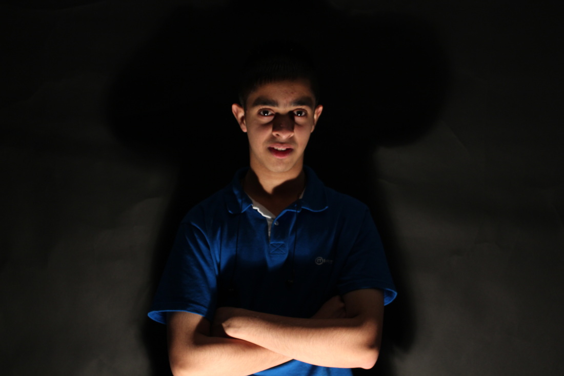
For this series of images, we had to explore the various lighting angles and also camera angles.
I shot the photos in colour and then I edited them in Photoshop.
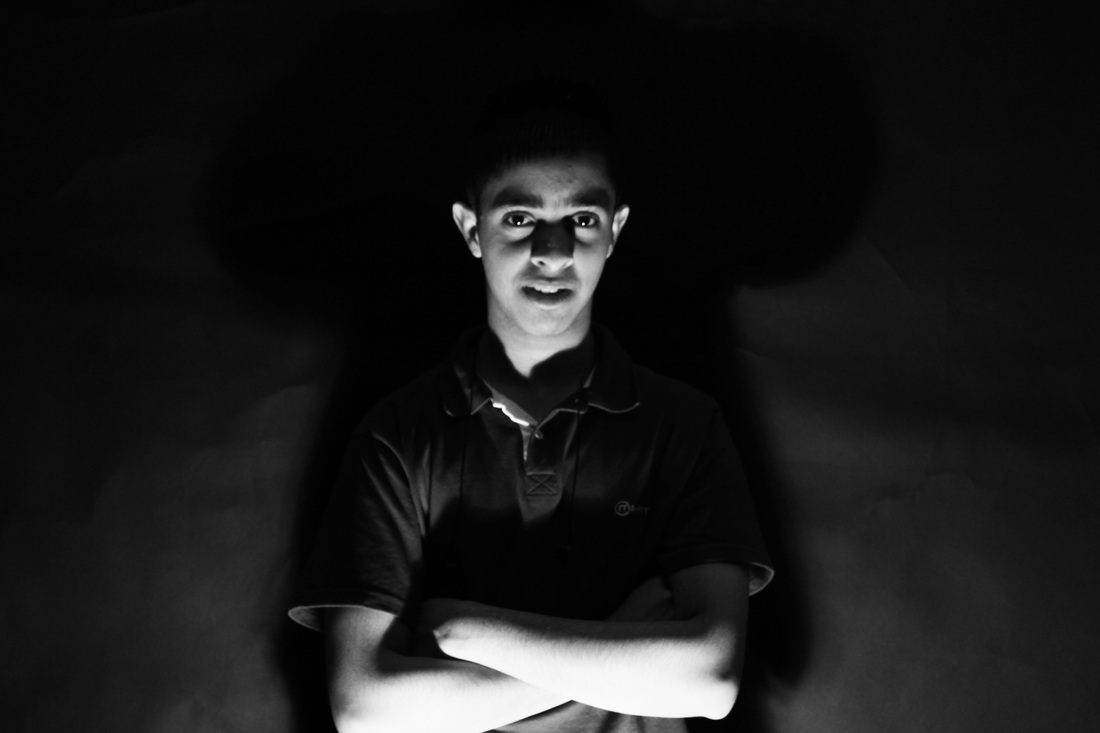
Task 1: use a black background and take shots from various angles.
1: Lighting high and behind the head
Above the head (directional lighting)
45 degree lower
Eye level, (flat lighting)
45 degree lower
Floor Level
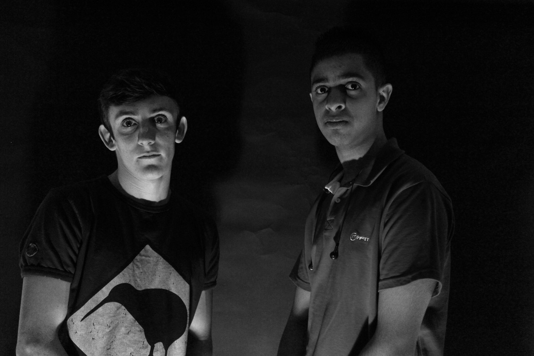
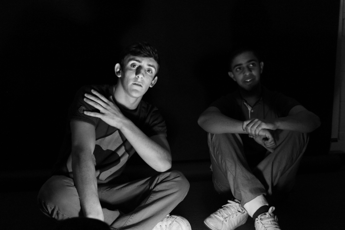
I took all photos on the left hand side and wanted to see what they would look in black and white, and compared each.
I shot the photos in colour and then I edited them in Photoshop.
Task 1: use a black background and take shots from various angles.
1: Lighting high and behind the head
Above the head (directional lighting)
45 degree lower
Eye level, (flat lighting)
45 degree lower
Floor Level
I took all photos on the left hand side and wanted to see what they would look in black and white, and compared each.
|
|
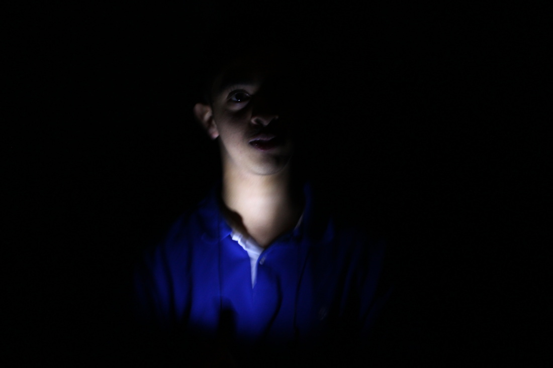
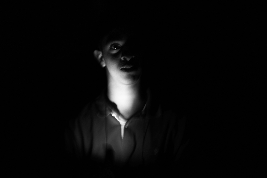
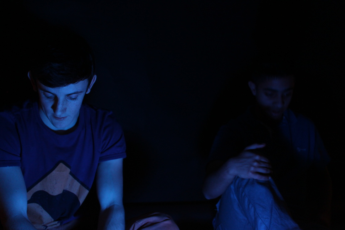
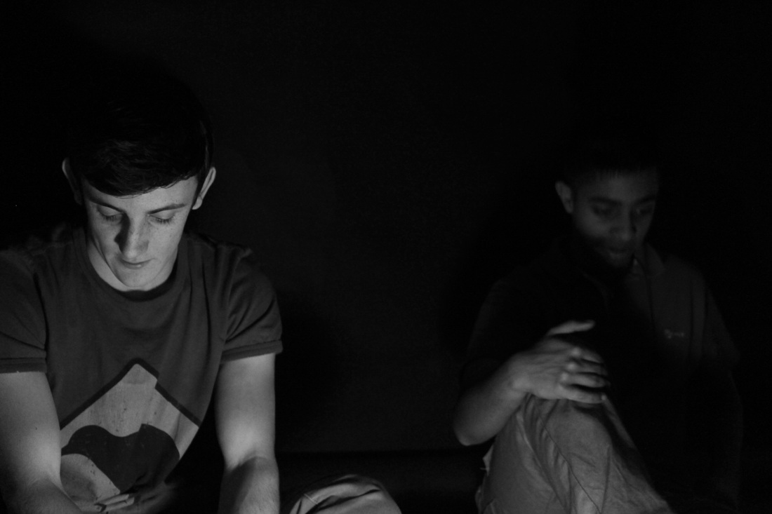
I took the shot on the left hand side and wanted to see what it would look like in black and white for the rest of my shots and see which is actually the best. I think that for this, I do like the one on the right however I like to see the blue top as if gives a brighter depth to the overall photo. I do like the black and white photo as it seems quite subtle.
|
|
I think that this photograph is quite interesting, as I like the way the light is falling onto his face. I think that this particular one again, looks better in colour simply because it looks really bright and the blue looks really vibrant compared to the dark background. On the right, I do like this in black and white however you don't get a feel for how vibrant the shirt is.
|
|
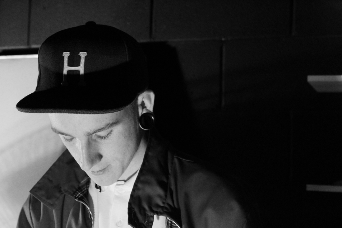
I like the way that this photograph was taken, I really like the way it has been photographed. I also like the colour on the first photograph, I like the green hue, I think it looks really nice and very mysterious which is really intriguing. However, I do like the one on the right, I like the subtlety of the b&w and looks matte which is another reason why I think black and white, works particularly well for this shot.
|
|
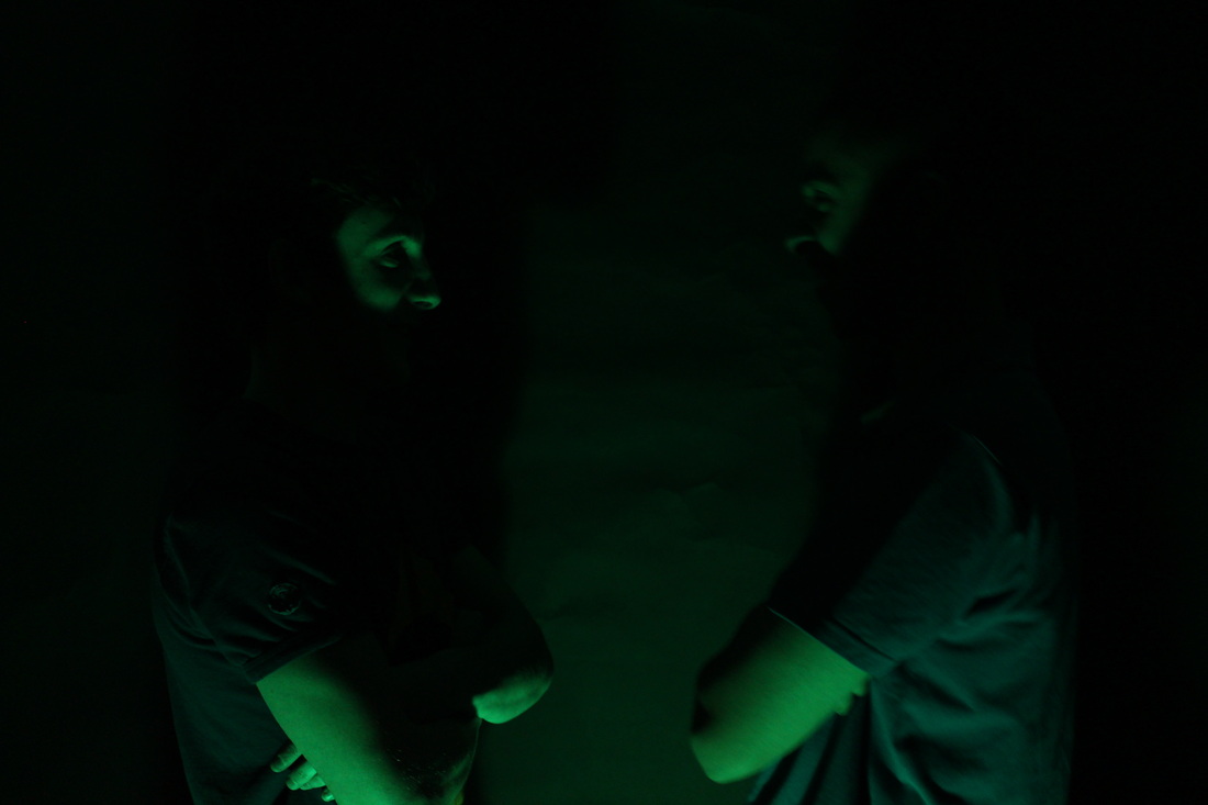
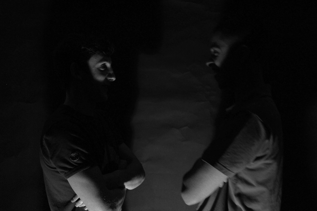
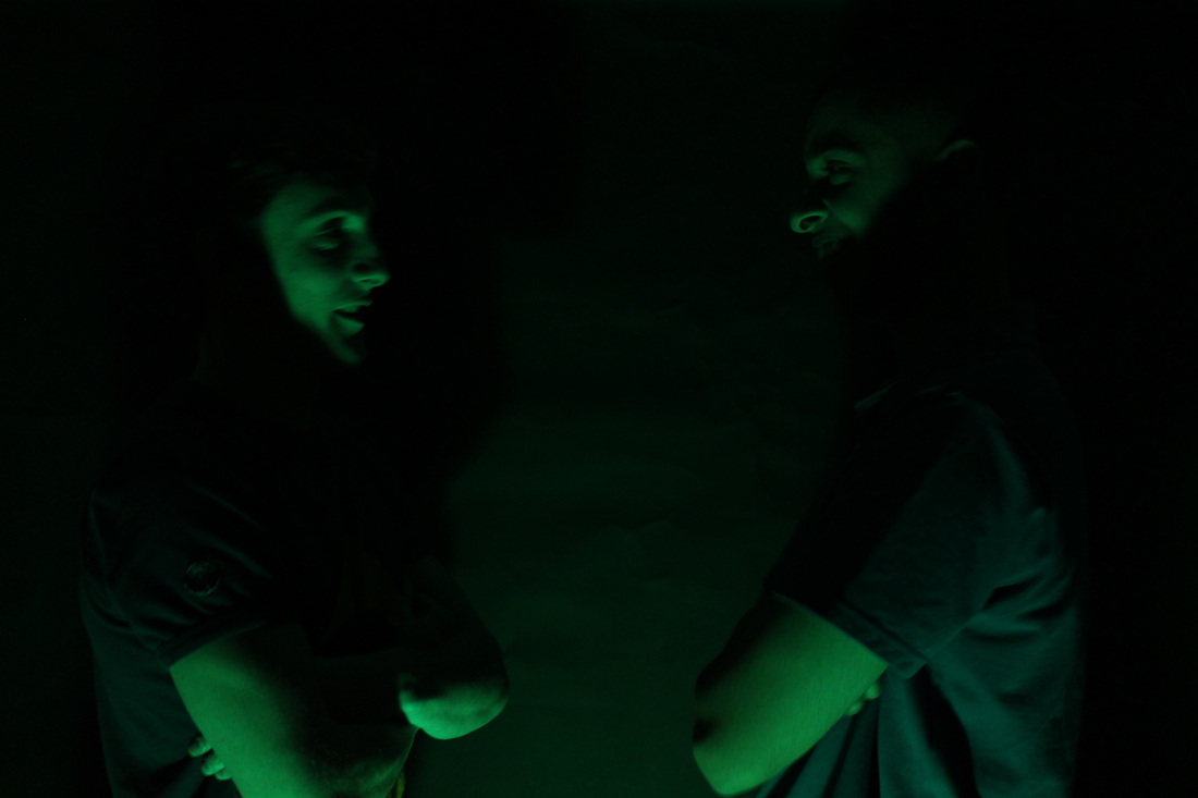
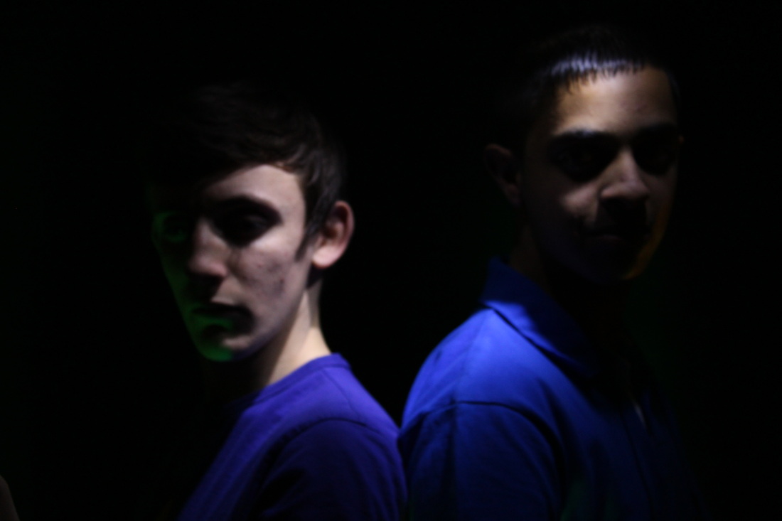
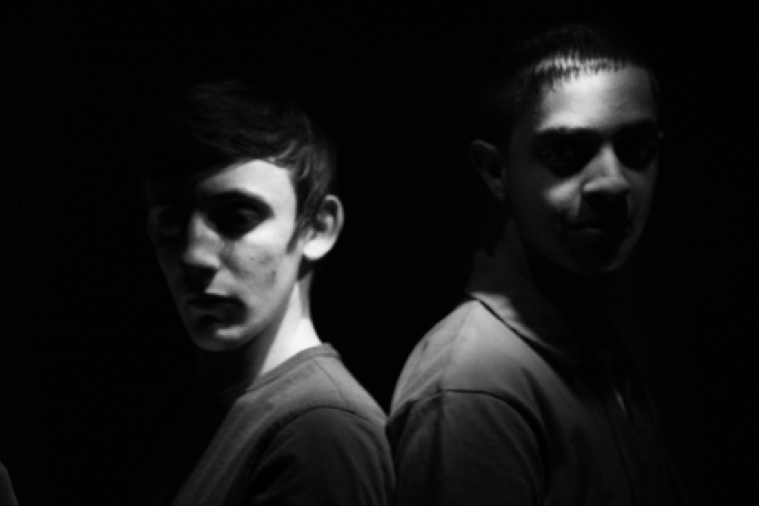
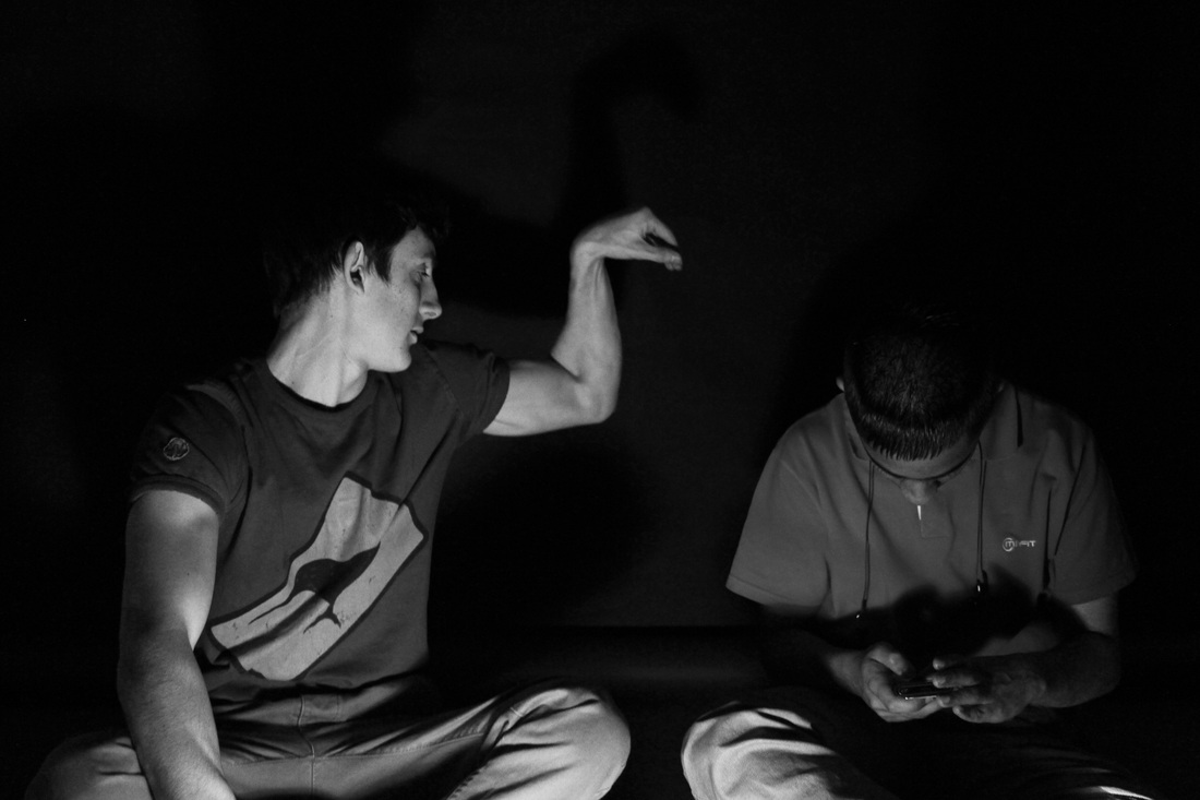
I think that the first photo is the clear winner for me in these two picture, I really like the way the green is shining on the faces and arms of the two boys. I really do like the way that it has been shown too. The b&w for me isn't really that strong, I don't know why I just feel that I like to see the colour of the green coming through. For me the colour is the clear winner in these two.
|
|
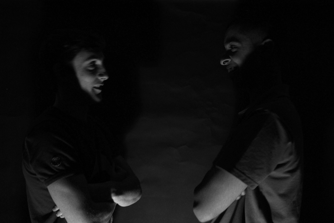
I think these two shots are really intriguing and are really nice photos. I for one like both, colour and black and white in these two. I think that the colour lets you see the colour on the two boys and looks rather alien like which is really nice. However, I do really like the b&w version, I think you can see more of the expression in the faces of the boys and the light is perfectly created on them.
|
|
For these two, I think I prefer the black and white, simply because I think the light looks better I feel like it's more crisper and clearer to the the coloured version. I think that the black and white looks better and more appealing.
|
|
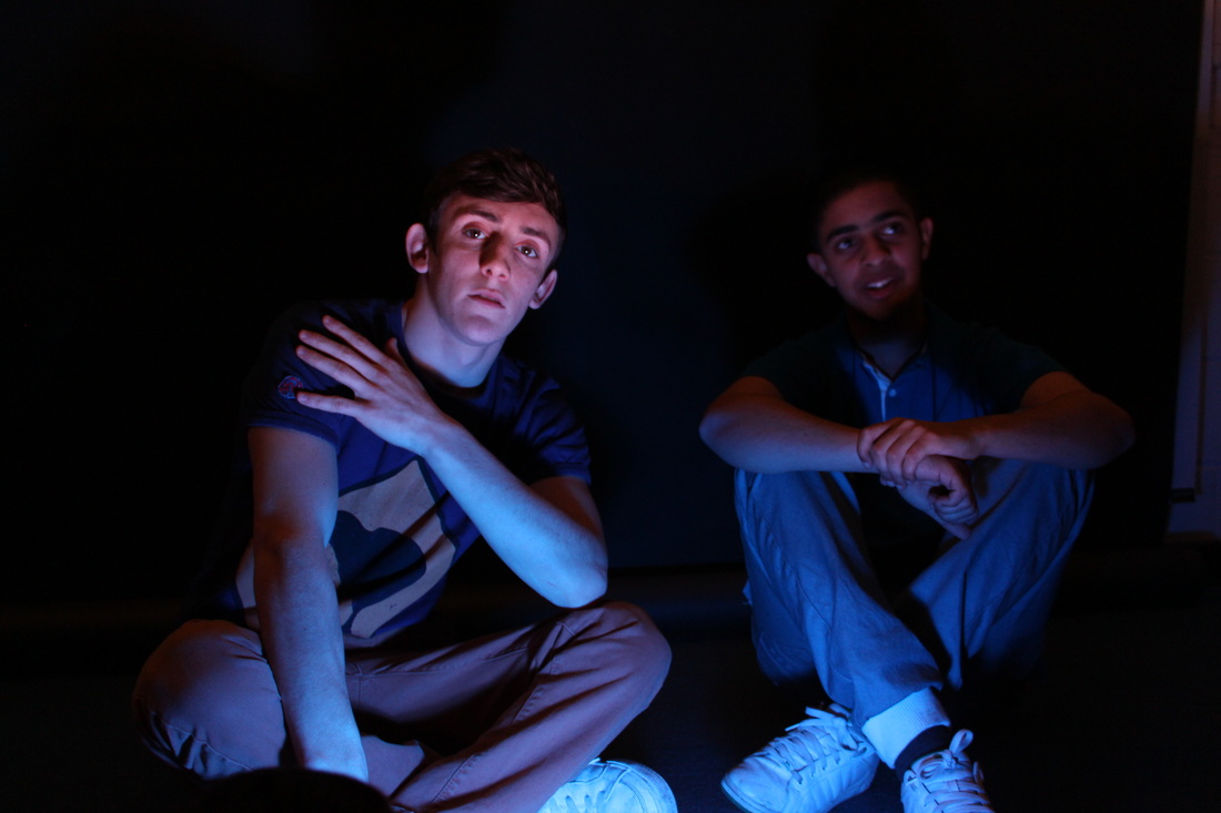
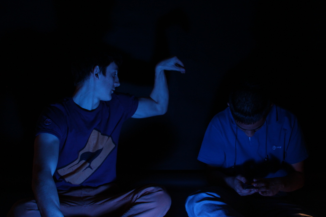
I really do like the coloured version, of these shot photos I think that the reason for the colour being the strongest is because I like the blue hue that's showing through. I think it looks stronger and looks really quirky and for me, simply looks better. The black and white is still really nice, however I like the way the the light is shining on the two boys.
|
|
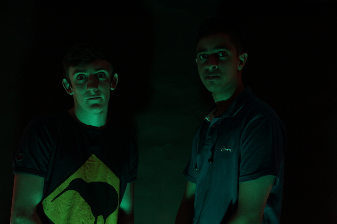
I feel like these shots are the same for me, I don't feel like there's a clear cut winner for which looks best. I don't know which I prefer, I feel that both these shots are the same and I like them either way, I really like the colour because I like how innocent the first boy looks, and I feel like that's what;s nice, the light shining on his face is really nice. However, the black and white shot is again the same for me.. I really like the way that the light is falling on the first boys' face and I really like the subtle feeling of this photo too.
|
|
I feel that the black and white photo is particularly the best in this case, I feel like the black and white has a lot more to offer and you can see what's going on with no problem and looks really nice with the shadows created on the pair. The light looks to be in the perfect spot too, with the colour I feel like it's lacking something and I just feel that it's not at strong.
|
|
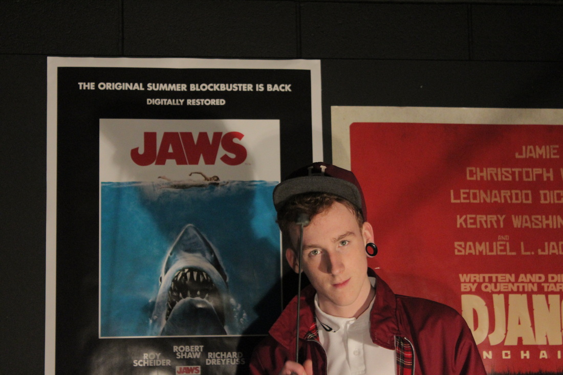
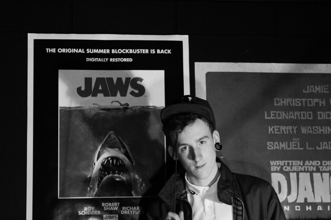
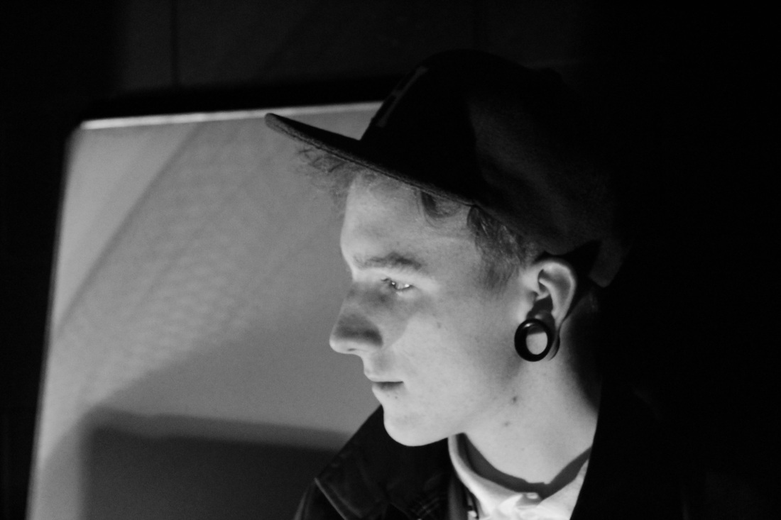
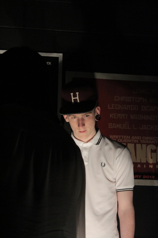
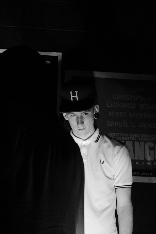
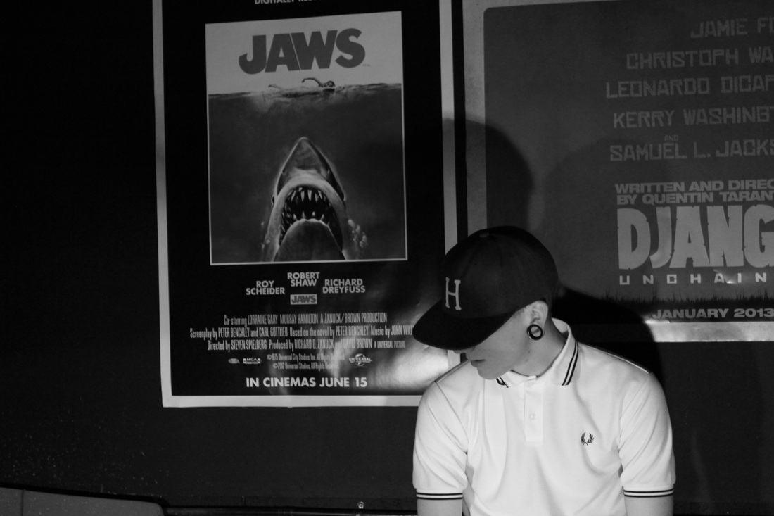
With these two photos, I don't know which is the best as I think both shots are really striking and have a really nice look to them. I like the black and white simply because I like the white shirt, with the white from the posters on the JAWS and DJANGO, as it looks really nice and look subtle too, I also really like the shadow which has been created. For the colour, I still like the same aspects, except it's not the white. The red of his jacket, with the red of the posters looks really well suited.
|
|
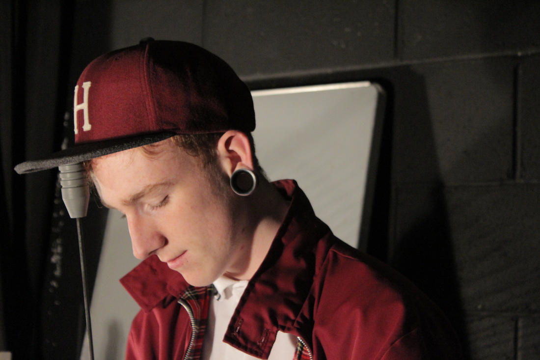
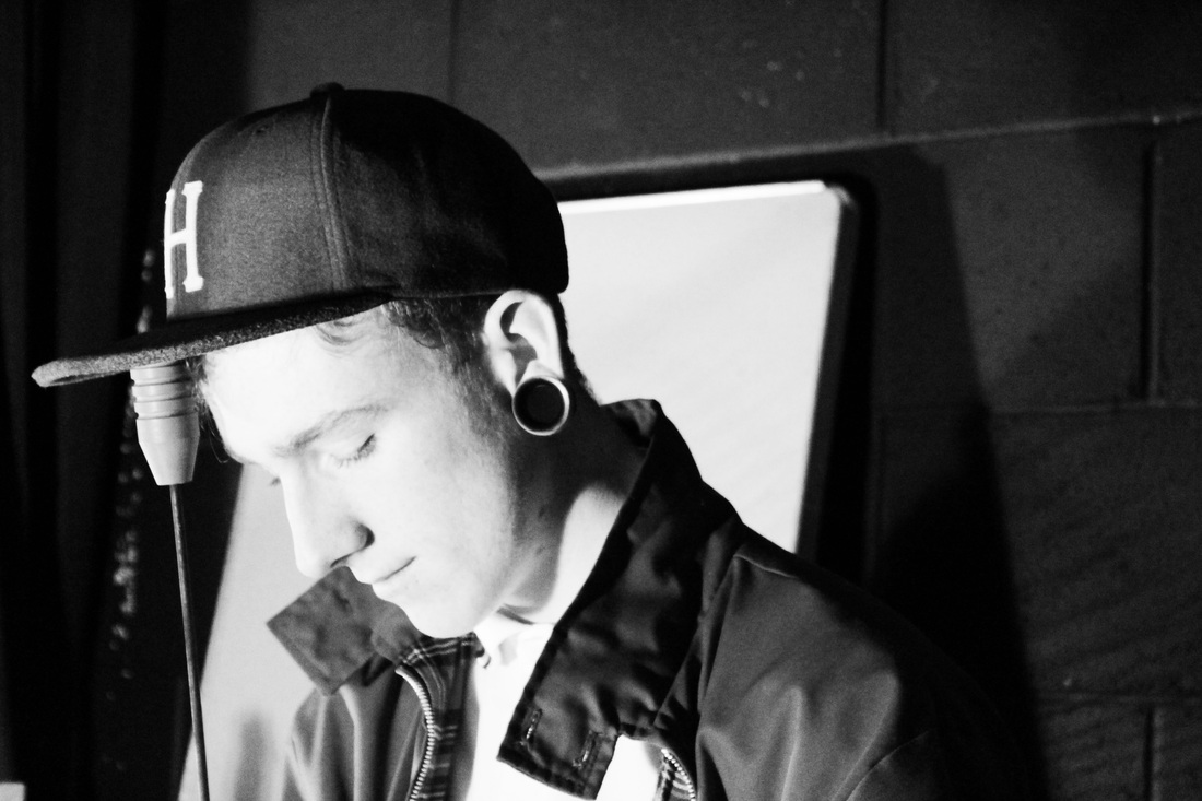
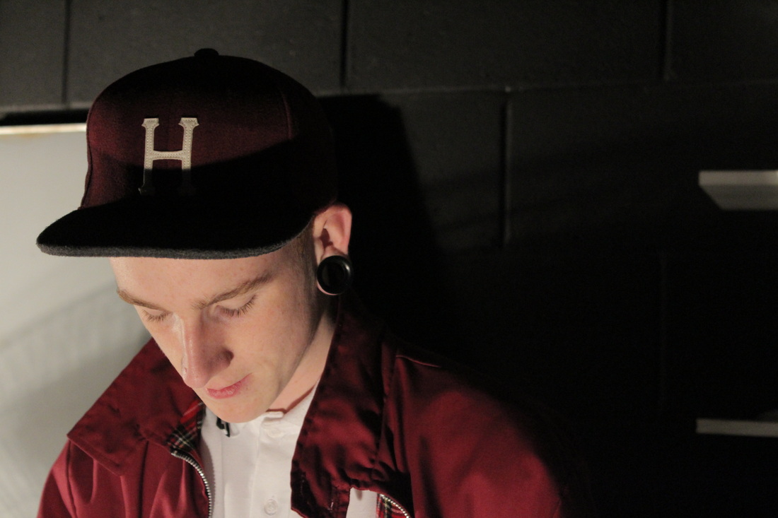
For these photos I feel like the black and white is my favourite for these shots, I just like how the light was placed, and that he had has eyes either closed or he was looking down. I really think that this set is the strongest of these shots. I really prefer the black and white version, however I feel like the coloured version is rather nice too, I think it's colour of the red that really stands out.
|
|
I feel like the, coloured version in this set is really out-performing the black and white version. Simply because I like to see the colour red in photographs I feel like it adds a depth to the photo. With the other I think it's still a nice photo just I feel like it's left in the shadows.
|
|
In this set I feel like the colour is lacking, simply because I like the darker shadows on the black and white version a lot more. With the black and white I feel like looks a lot more appealing and again, has a certain depth to the photo.
|
|
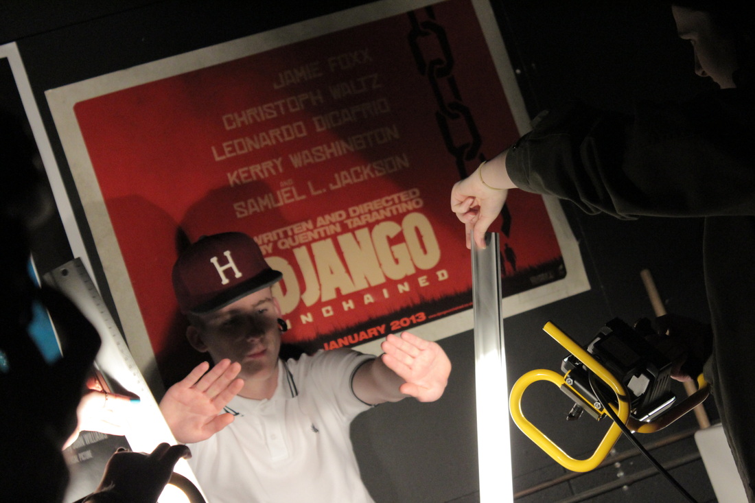
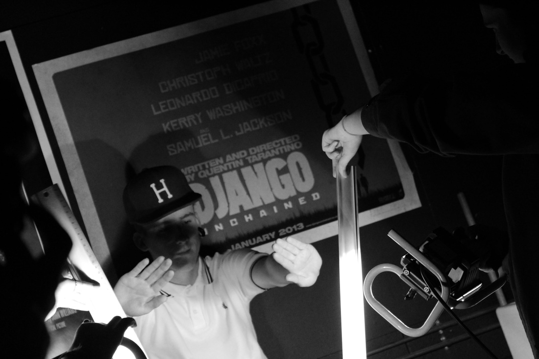
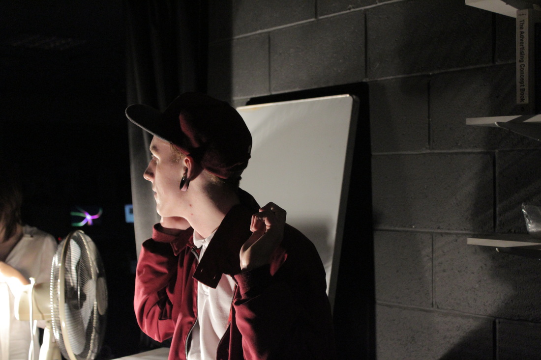
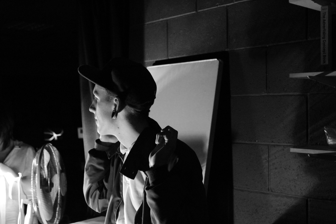
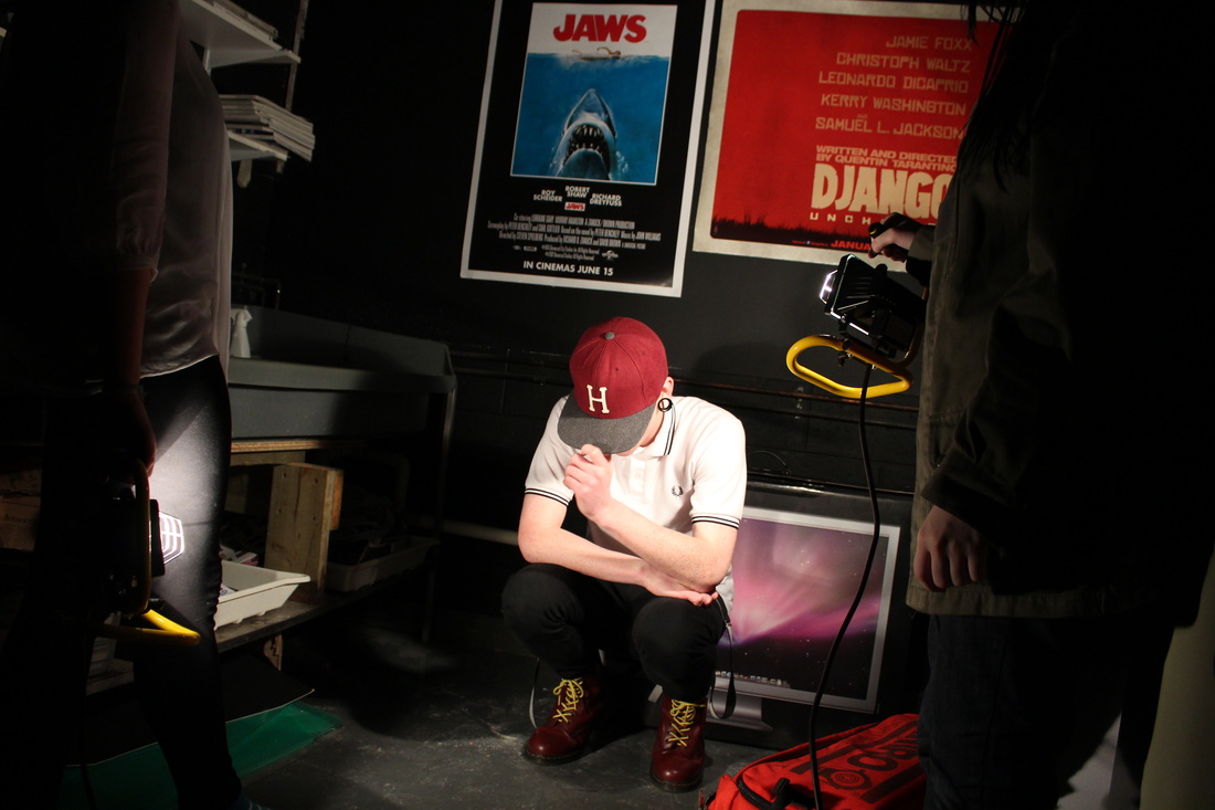
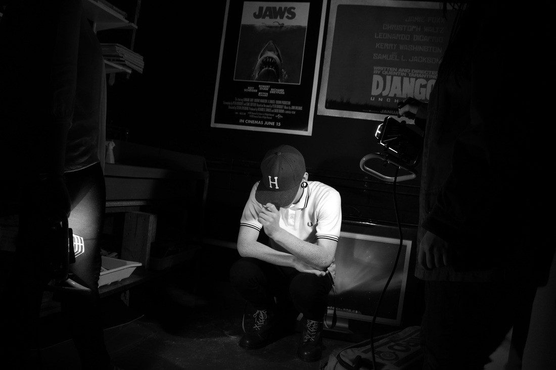
I thought we'd need to get a photo of the set up, too so this was taken. I think for this set I prefer the black and white again. I like the colour in the first one, however the shadows aren't as strong as I'd have liked, hence why I feel that the b&w looks more appealing and it far greater than it's other version.
|
|
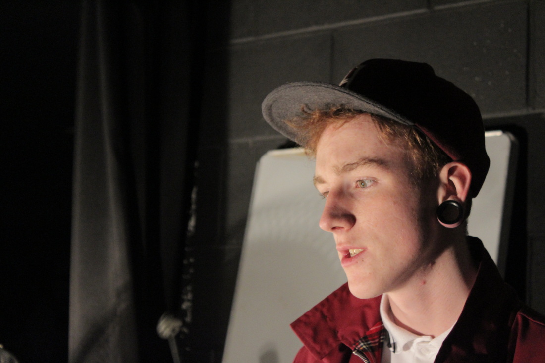
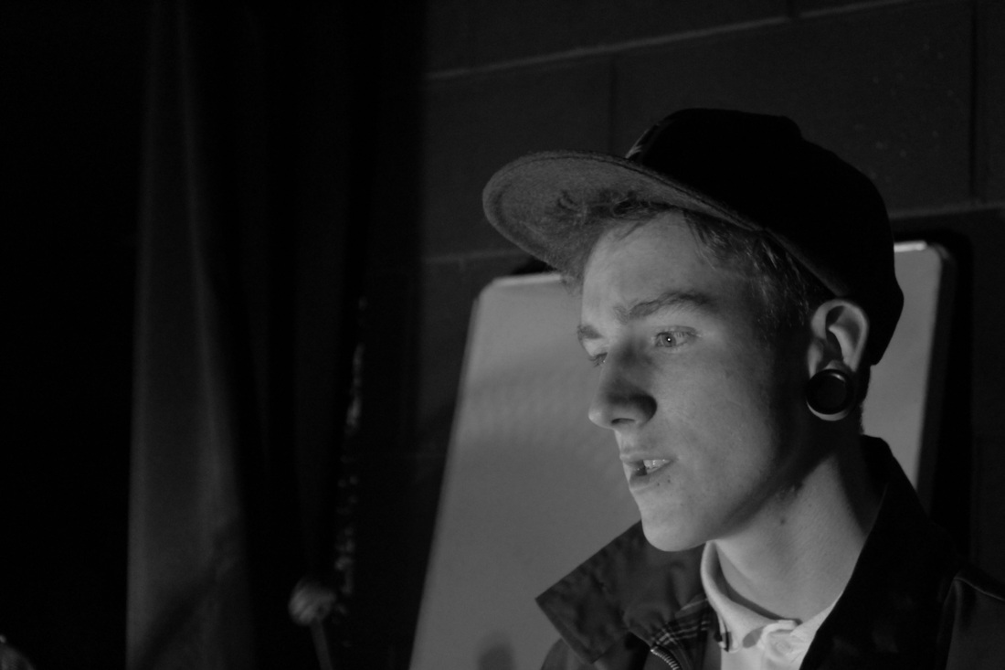
For this set, I really like the colour version a lot better, simply because the colour looks striking and it really nice. For the black and white, I feel like it is a really nice and interesting shot, however I feel like the colour is a main thing in these two shots, I really think that the colour is important in this case.
|
|
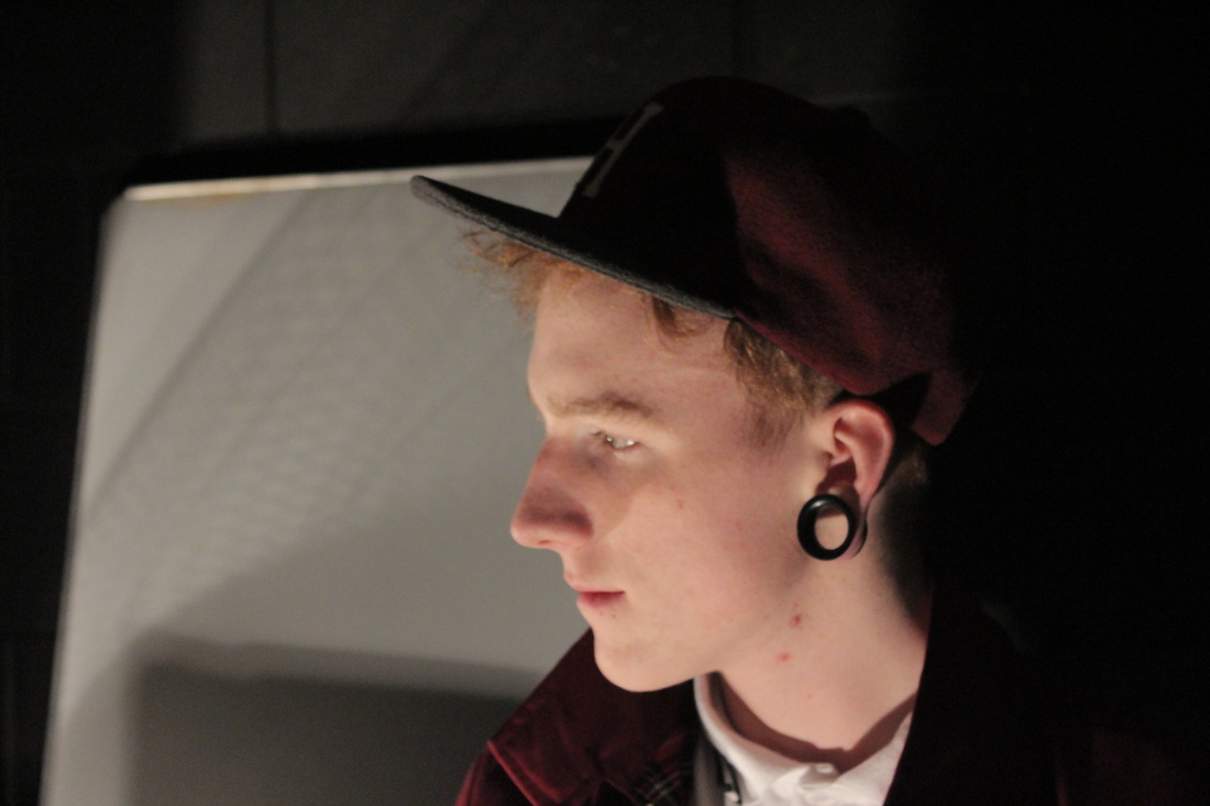
With being told we needed to get some of the set up this was taken, and I really like this shot. I think it's interesting and quirky. I think that the black and white looks more appealing in this case, the shadows look greater and bolder which is what I wanted, The colour version seems to be lacking with the shadows, however it's still a good photo.
|
|
I think that the black and white excels here, as it looks very subtle and I like the way the shadow is falling. With the colour, I still feel like it's a good shot however it isn't the best one I have on this page.
|
|
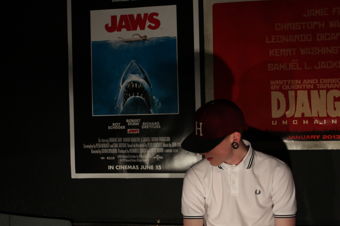
With the taking of this photograph as we needed one of our set up, I quite liked this overall photo. I thought it looked very different and was quite successful. I really like the black and white version, because I like that you can see the lights shining on him and you can see bright white of the shirt, I feel that this is more appealing than the first.
|
|
With these two shots I think that the black and white is again, superior. I really like the way the the shadows are cast on the wall, and that I like how smooth and subtle this photo is. The colour is still nice, however I think it looks cluttered somehow, I feel that the colour wasn't needed here in this case,
