Kinetic Typography:
This is a blend of "an animation technique, mixing motion and text".
Designers will either use software such as Adobe Flash, After Effects or Apple Motion to produce this flawless and at times an hypnotic typography technique. Its popularity has been rising rapidly, prompting Vimeo to create an entire channel dedicated to it. Videos include motion typography to go along with, for example, famous movie monologues. Also. in the last few years, the use of kinetic typography has become popular in all forms of media (commercials, film openings, product demo videos, etc.) It adds style and makes text more engaging and dynamic.
My general understanding of kinetic typography is that, the words should be used to convey moods or feelings, they don’t need to be the message, and they are just there to support it. My feeling is that the words should echo the spoken words rather than simply repeat what’s being said.
My general understanding of kinetic typography is that, the words should be used to convey moods or feelings, they don’t need to be the message, and they are just there to support it. My feeling is that the words should echo the spoken words rather than simply repeat what’s being said.
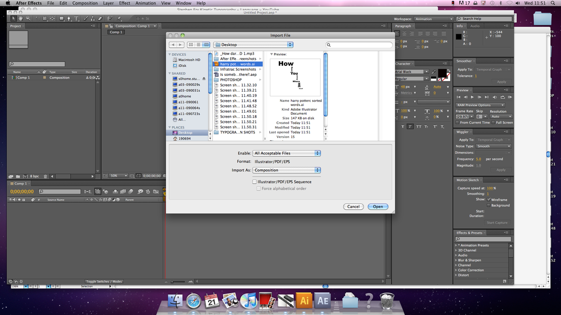
First I had to find an audio file from a chosen film, here I found one from Harry Potter and The Deathly Hallows Part One. My audio file was of Harry (Daniel Radcliffe) saying "How Dare You Stand Where He Stood" to Severus Snape. I chose this because I thought it would a be a good piece of text for this particular task. I then saved this audio file onto my desktop and kept listening too it, to get understand which word is said at which part in this 3 second clip.
Step One:
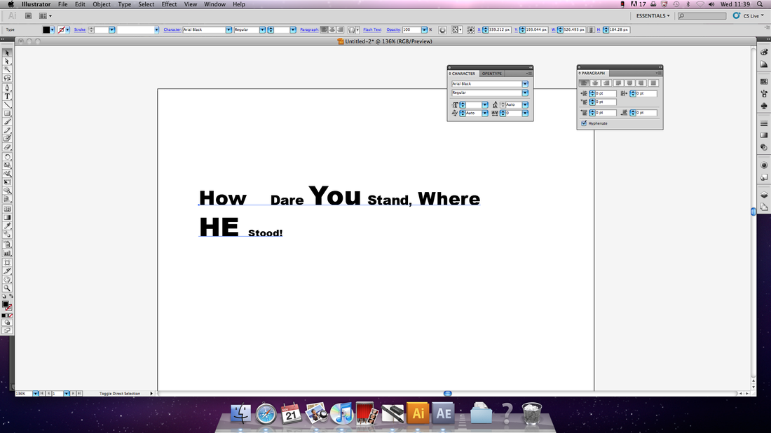
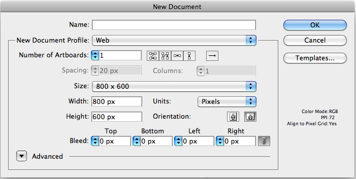
I opened up Adobe Illustrator, Here I set up what size paper I needed which was 800 x 600, and also which document it should be saved onto, here I chose web. I then set out on creating my layout for this particular piece of text, on a piece of plain paper I wrote out how I would want it too look once it had been finished, this was to give me an idea of what these words would look like on screen. I then used the text tool, to then insert chosen piece of text from my sourced material. I had to make sure that there’s plenty of space between the lines. It’ll be easier to separate the text onto different layers.
Step Two:
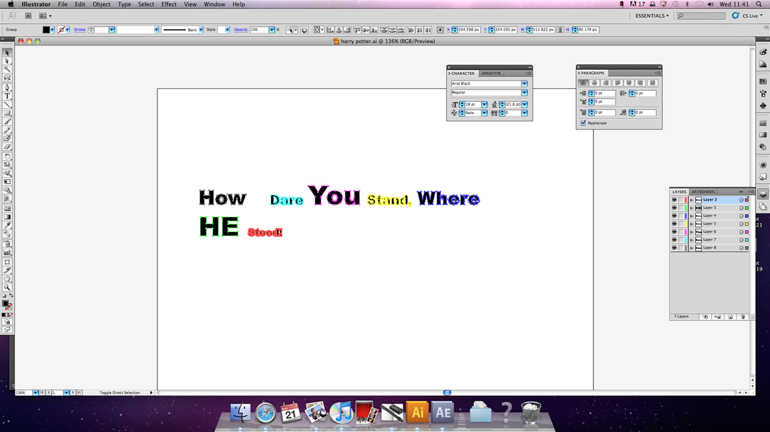
Since I am going to be animating these words, individually, I then need to put all of these words onto separate layers so it's easier for me to create this animation. When all my text was selected I had to go to un-group these words to do this I went to object --> Un-group. I then clicked on anywhere that was near an empty space in the area around the text. Then had to click and drag to select the first word of my script. I then had to
group it together again by going to object –> Group. Select and group the next word, then I repeated this for the entire script. Once all my words had their own groups, I then had to select all of these words and then open up the layers palette. From the options menu I had to select "Release To Layers (Sequence)". Now I had to move my newly created layers, onto there new nesting layers. Now it’s time to start laying them out, according to my plan. Here I can re-size, rotate and colour my chosen words. This is when my document will start looking quite cluttered yet have an elegant feel about them. I followed my original plan and created a 2D layout of my text. I didn't try and add any effects into this yet, as that can be accessible in After Effects.
Step Three:
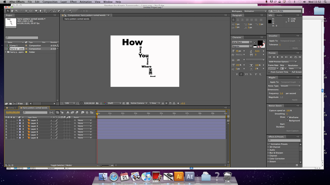
Here I now opened up After Effects, I had to create a new composition, that was 800 x 600. I then made sure that my animation is a little bit longer than my sourced material. This is important for me to set now, so that all of my compositions will be around the appropriate length. This will then make it easy for me to then sync my animation with the audio file. I then had to open up my Illustrator file, and set it right in the middle on the screen. Here I now had to double click the new composition in the projects palette, open it and make sure that I have properly split up my layers in Illustrator, and then all my elements of these words will be all be on separate layers. My text was black, so I had to change my background from black to white on composition --> background colour. Now my animation will be split into easy accessible sections. Now I had to animate these sections individually and with precise care and attention to detail, before me then bringing them together in the animation as a whole. Now my animation looks quite close to the specific design in which I had planned out in the beginning of this task.
Step Four:
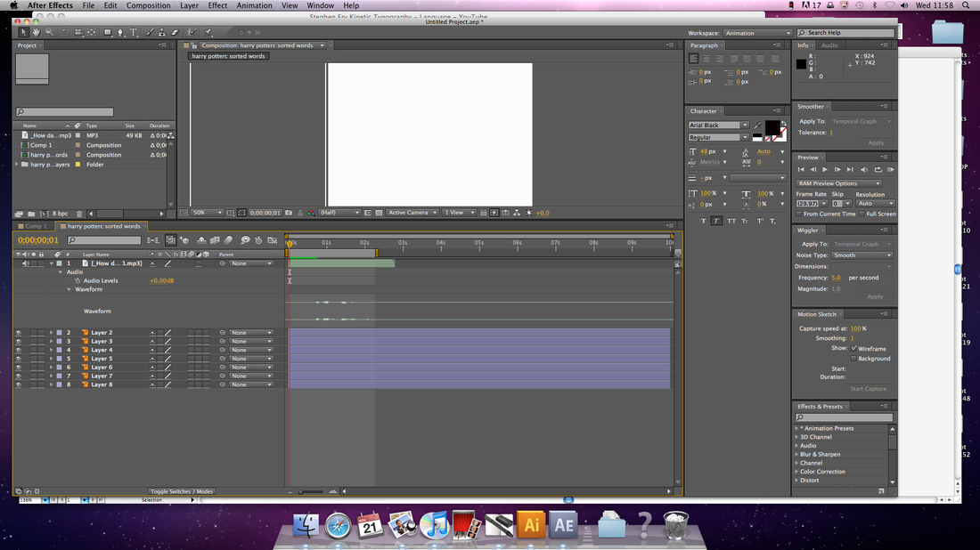
The most identifiable characteristic of any kinetic typography animation is that the type on the screen has to synced up with the audio file. This is where the word either pops up, becomes angular, centered, etc, with the specific timing in which the word is said. Now that my audio is synced well, once Daniel has said “How” the word how, will then fly across the scene and will give it a more dramatic feel. This will then happen with the rest of the six words. The easiest thing to create is where the words fly across the scene, bounce in, and grow. The easiest thing for the moment is getting the word just to appear. To actual get my audio synced I had to first off import the two files; the audio and the Illustrator file into my new composition in After Effects. I then made my audio file the first thing in this animation. I then had to position my word script sliders until the audio was linked up with the layer that corresponded on screen at that particular moment of the animation. I then needed to select the RAM preview button which was on the right of the screen. I then saw that my animation and audio was working perfectly after a few tweaks and was pretty astounded with the results.
Step Five:
Then I had to assemble the other multiple sections of the animation with my final composition. I then decided to try and blur the writing with a few words of this animation, and I played it back and didn't see any difference, what so ever. I just saved this a screen shot which will be placed under this with the rest of my screen shots taken whilst creating this impressive animation.
Step One:
I opened up Adobe Illustrator, Here I set up what size paper I needed which was 800 x 600, and also which document it should be saved onto, here I chose web. I then set out on creating my layout for this particular piece of text, on a piece of plain paper I wrote out how I would want it too look once it had been finished, this was to give me an idea of what these words would look like on screen. I then used the text tool, to then insert chosen piece of text from my sourced material. I had to make sure that there’s plenty of space between the lines. It’ll be easier to separate the text onto different layers.
Step Two:
Since I am going to be animating these words, individually, I then need to put all of these words onto separate layers so it's easier for me to create this animation. When all my text was selected I had to go to un-group these words to do this I went to object --> Un-group. I then clicked on anywhere that was near an empty space in the area around the text. Then had to click and drag to select the first word of my script. I then had to
group it together again by going to object –> Group. Select and group the next word, then I repeated this for the entire script. Once all my words had their own groups, I then had to select all of these words and then open up the layers palette. From the options menu I had to select "Release To Layers (Sequence)". Now I had to move my newly created layers, onto there new nesting layers. Now it’s time to start laying them out, according to my plan. Here I can re-size, rotate and colour my chosen words. This is when my document will start looking quite cluttered yet have an elegant feel about them. I followed my original plan and created a 2D layout of my text. I didn't try and add any effects into this yet, as that can be accessible in After Effects.
Step Three:
Here I now opened up After Effects, I had to create a new composition, that was 800 x 600. I then made sure that my animation is a little bit longer than my sourced material. This is important for me to set now, so that all of my compositions will be around the appropriate length. This will then make it easy for me to then sync my animation with the audio file. I then had to open up my Illustrator file, and set it right in the middle on the screen. Here I now had to double click the new composition in the projects palette, open it and make sure that I have properly split up my layers in Illustrator, and then all my elements of these words will be all be on separate layers. My text was black, so I had to change my background from black to white on composition --> background colour. Now my animation will be split into easy accessible sections. Now I had to animate these sections individually and with precise care and attention to detail, before me then bringing them together in the animation as a whole. Now my animation looks quite close to the specific design in which I had planned out in the beginning of this task.
Step Four:
The most identifiable characteristic of any kinetic typography animation is that the type on the screen has to synced up with the audio file. This is where the word either pops up, becomes angular, centered, etc, with the specific timing in which the word is said. Now that my audio is synced well, once Daniel has said “How” the word how, will then fly across the scene and will give it a more dramatic feel. This will then happen with the rest of the six words. The easiest thing to create is where the words fly across the scene, bounce in, and grow. The easiest thing for the moment is getting the word just to appear. To actual get my audio synced I had to first off import the two files; the audio and the Illustrator file into my new composition in After Effects. I then made my audio file the first thing in this animation. I then had to position my word script sliders until the audio was linked up with the layer that corresponded on screen at that particular moment of the animation. I then needed to select the RAM preview button which was on the right of the screen. I then saw that my animation and audio was working perfectly after a few tweaks and was pretty astounded with the results.
Step Five:
Then I had to assemble the other multiple sections of the animation with my final composition. I then decided to try and blur the writing with a few words of this animation, and I played it back and didn't see any difference, what so ever. I just saved this a screen shot which will be placed under this with the rest of my screen shots taken whilst creating this impressive animation.
Here I uploaded a new document onto Illustrator.
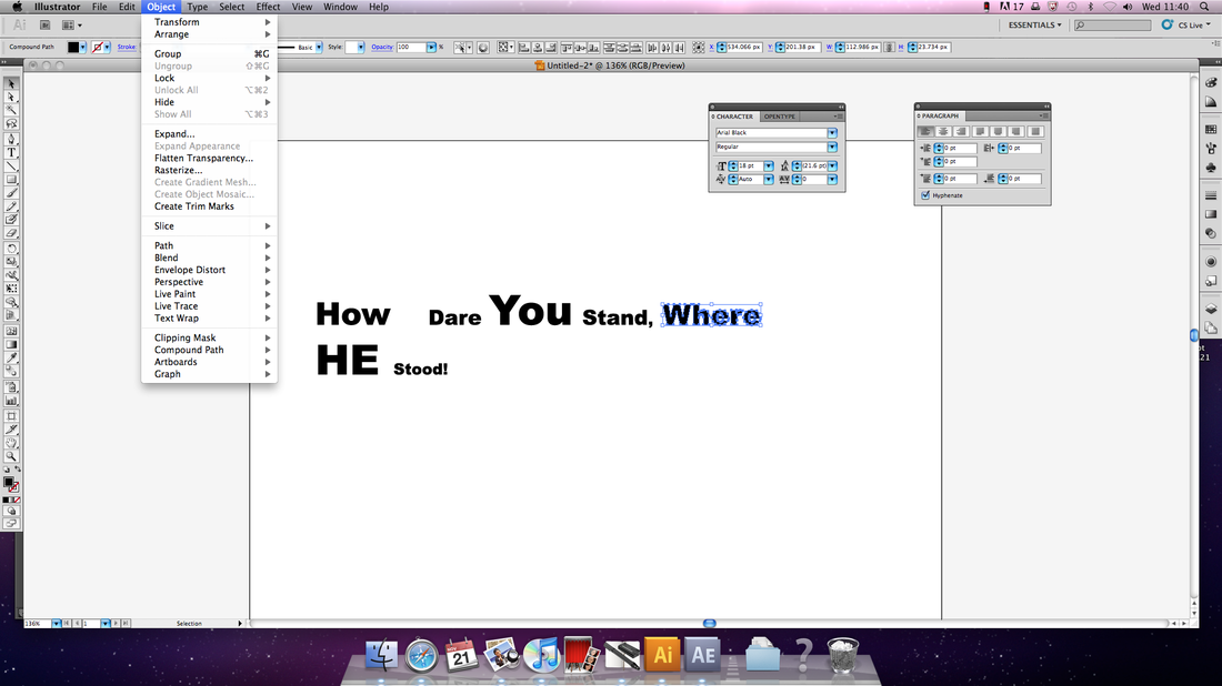
Here I was able to un-gruop these and this screen shot is of me grouping of these words.
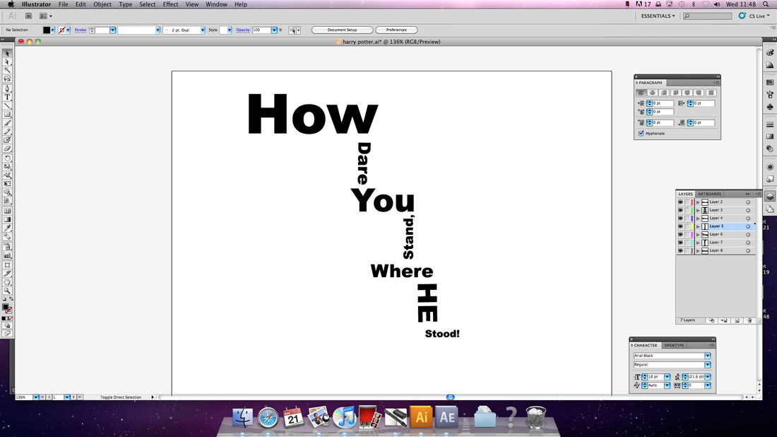
Here I followed my plan got this sort of outcome for the end look.
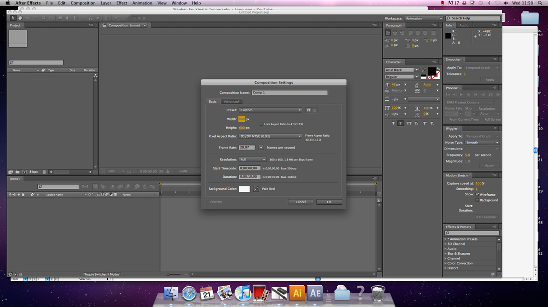
I opened up After Effects and made this document 800 x 600 to fit the writing scale.
This is which I imported in.
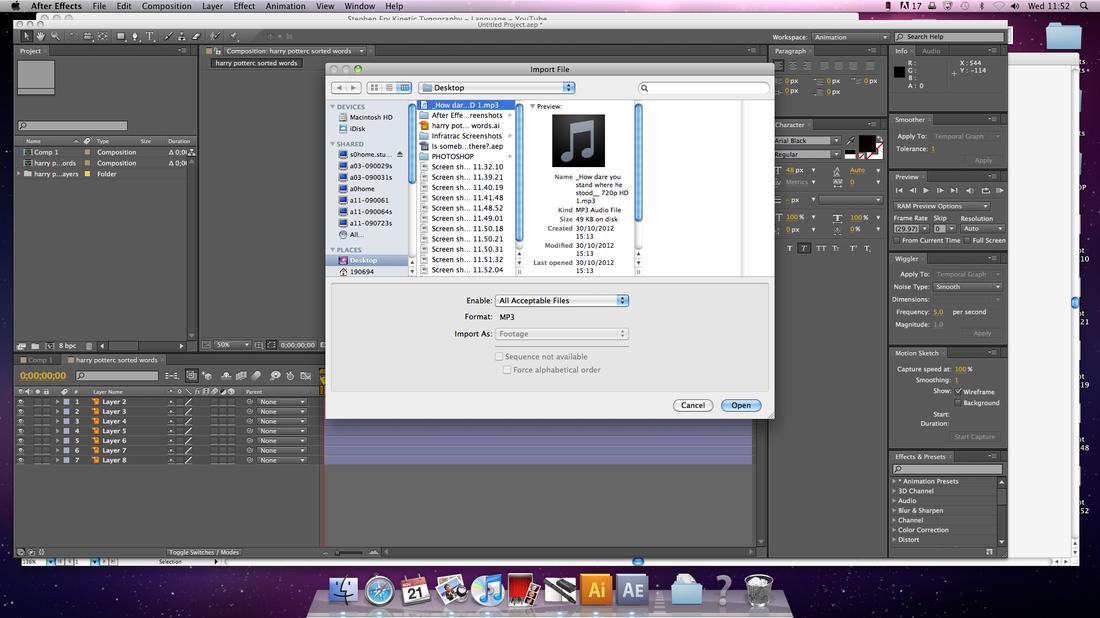
Now I had imported in my audio track.

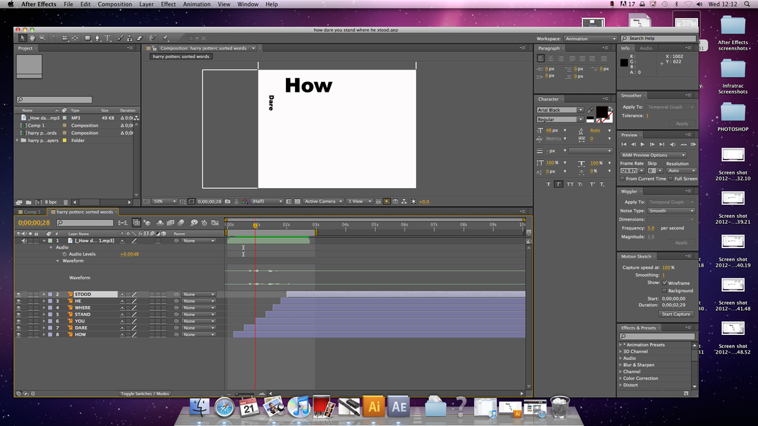
Here I started at the beginning of my animation.
Now you can see that the "How" will appear on the screen with the others following shortly behind

Now "Stand" how just come scaling up the document.

Here we can see all of the words in this animation along with the audio file.
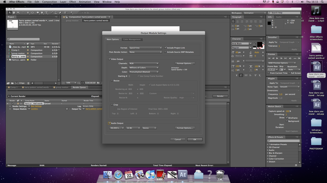
Here I rendered my final kinetic typography piece. I imported it into imovie, exported it as a quicktime movie then uploaded it to YouTube.
|
I wrote out my script and made some words bigger and small.
This is too show the different layers which was created through illustrator.
This is how big my document was, 800 x 600 from Illustrator.
I then imported my files into this composition in After Effects.
Here you can see each layer, and that I had renamed them.
Now I dragged it into my work space and it is there with all my layers.
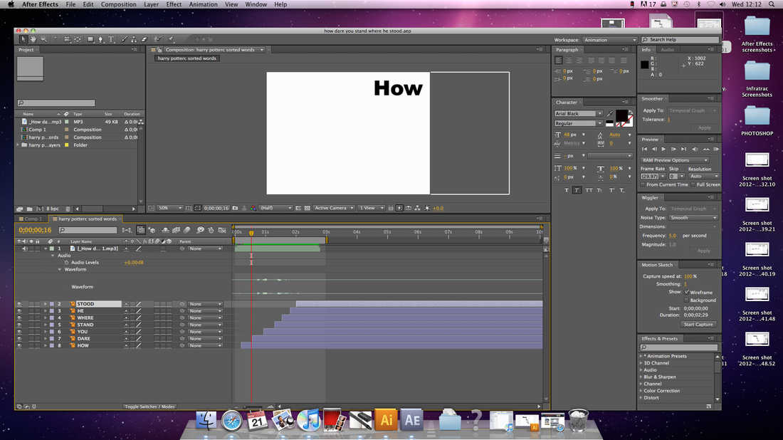
I had to then stagger out my layers to sync with when there where spoken and for when they'd come on screen.

Here you can see "How", "Dare" and "You" now coming across the screen with how it should be synced.

Closely followed by "Where".
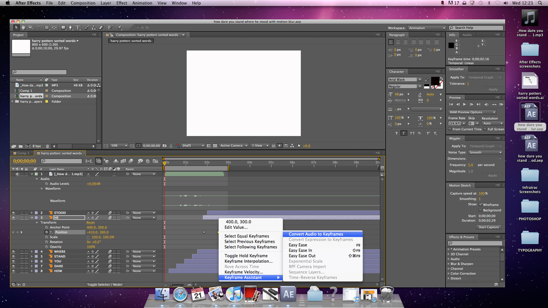
Here you can see how you can "ease in" words if need be.
|
|
|
|
Fonts play a major part in typography animations, as they can add drama which is what is needed in specific typography texts.
In typography, a font is traditionally defined as a quantity of sorts composing a complete character set of a single size and style of a particular typeface. For example, the complete set of all the characters for "9-point Bulmer" is called a font, and the "10-point Bulmer" would be another separate font, but part of the same font family, whereas "9-point Bulmer boldface" would be another font in a different font family of the same typeface. One individual font character might be referred to as a "sort," "piece of font," or "piece of type". Fonts traditionally defined as a quantity of sorts composing a complete character set of a single size and style of a particular typeface. For example, the complete set of all the characters for "9-point Bulmer" is called a font, and the "10-point Bulmer" would be another separate font, but part of the same font family, whereas "9-point Bulmer boldface" would be another font in a different font family of the same typeface. One individual font character might be referred to as a "sort," "piece of font," or "piece of type".
Font nowadays is frequently used synonymous with the term typeface, although they had clearly understood different meanings before the advent of digital typography and desktop publishing.
There are many names used to describe the weight of a font in its name, differing among type foundries and designers, but their relative order is usually fixed, something like this:
Hairline
Thin
Ultra-light
Extra-light
Light
Book
Normal / regular / roman / plain
Medium
Demi-bold / semi-bold
Bold
Extra-bold / extra
Heavy
Black
Extra-black
Ultra-black / ultra
The terms normal, regular and plain, sometimes also book, are being used for the standard weight font of a typeface. Where both appear and differ, book is often lighter than regular, but in some typefaces it is bolder.
