Magazines:
Here is a look on different fashion magazines:
|
|
|
These three photographs above are to show the differences between fashion magazines:
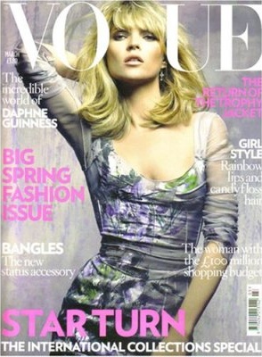
The first one is of Vogue, and this has lots of colour and is more appealing to the than the other three. I really like this first cover photo as I like the way that the 'G' has been lost in place for the model to stand and the other words fit around her.
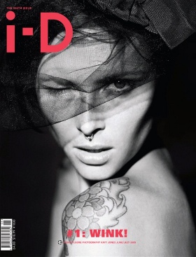
The second is i-D, I've never heard of this fashion magazine. It does looks rather interesting does this magazine cover. I like the way this it is in black and white and has a raw edgy feel to it. I also like that the only colour on this magazine is the pink of the title and the bottom line.
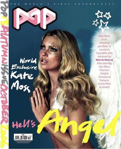
The third photo magazine is 'POP', again I've never heard of this magazine, however I really like this cover. I really like the fact that there is loads of colour on this cover. The colours are pink and yellow as they look the most bright and bold colours, that would catch people's eyes.
The first one is of Vogue, and this has lots of colour and is more appealing to the than the other three. I really like this first cover photo as I like the way that the 'G' has been lost in place for the model to stand and the other words fit around her.
The second is i-D, I've never heard of this fashion magazine. It does looks rather interesting does this magazine cover. I like the way this it is in black and white and has a raw edgy feel to it. I also like that the only colour on this magazine is the pink of the title and the bottom line.
The third photo magazine is 'POP', again I've never heard of this magazine, however I really like this cover. I really like the fact that there is loads of colour on this cover. The colours are pink and yellow as they look the most bright and bold colours, that would catch people's eyes.
I think for my own magazine cover, I want something that will catch people's attention at the exhibition where this will be held.
I was thinking something quite minimalist. I would like my model to be in the centre, I'm thinking of having it in black and white as this will show distinct shadows in the shots.
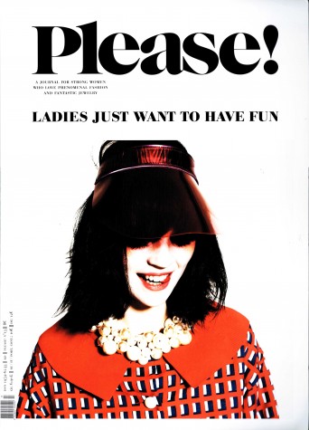
I would like the have bold, black writing with a really distinctive font, but one that doesn't take you a long time to actually understand what the words say. The magazine underneath is a brief cover that I saw and thought it was quite interesting. I would've had my model in the model and the cover lines and title at the top of the page, and the cover lines would be around the side of the model.
I was thinking something quite minimalist. I would like my model to be in the centre, I'm thinking of having it in black and white as this will show distinct shadows in the shots.
I would like the have bold, black writing with a really distinctive font, but one that doesn't take you a long time to actually understand what the words say. The magazine underneath is a brief cover that I saw and thought it was quite interesting. I would've had my model in the model and the cover lines and title at the top of the page, and the cover lines would be around the side of the model.