Story Boards:
Here is my story board for my advertising trailer.
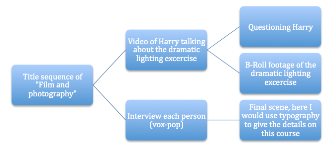
This image above is a basic view of how I should go through with creating my advert. In my final piece I didn't do it exactly the same.
The title sequence of my advert was actually near the end of my advert, rather than at the beginning. At the beginning I had some of the students setting up a shoot and I thought that this would look better at the beginning than somewhere in the middle. For the second part of my advert, I had Harry talking about the dramatic lighting exercise, and where we question him. After that, I went back to another piece of footage where the students create a shoot. I quite liked this as it looked quite professional and I thought it was very intriguing too. Then for the ending I put a vox-pop in of where we ask the students a simple question of: "Sum up the course in one word?" - and everyone would reply with a simple word and I would put them all together to create a vox-pop. I really like the effect on this, as it looks really nice and has an intriguing effect and would grab the viewer's attention.
To end the video, I put in some nice typography to make it look more eye catching. I used the font of Helvetica Neue. I liked this because it was thin text so to me, it looked more appealing than any of the other fonts.
