Testing typography tutorials:

|
|
|
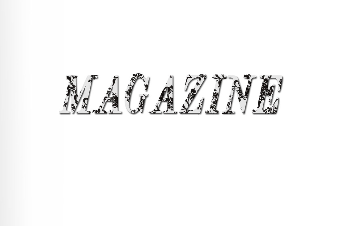
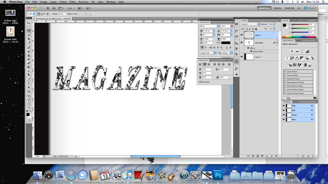
I created this image on Photoshop I wrote out the word 'MAGAZINE' and downloaded some flower brushes off the internet.
1. I Created a new document with dimensions; 1200x800px then create a new layer and select the gradient tool, click the gradient preview in the main toolbar and choose the gradient that goes from black to white. In the main toolbar change the style to radial and drag from the top right corner to the bottom left to get something similar to the image below. Now just change the opacity of this layer to 15%. 2. Select the text tool then click once in the middle of the document, first change the paragraph alignment to center then choose a bold sans-serif font, I used Helvetica but you could also use Arial Black. Now change the size to 150pt and type your message, it looks better if you use more than one line so just hit Return to go to the next line as you normally would. Go Window>Character to open the character adjustments, highlight your text then adjust the leading (vertical spacing) and tracking (horizontal spacing) to get your text spaced appropriately, I had to change the tracking to 100. Your image should now resemble the image shown below, note that it’s important that there is enough space between the letters to add the plants. 3. First, in the layers panel, change the fill opacity to 0% then right click on the text layer and go to blending options and add a drop shadow using the settings shown below, I’ve also shown the result I got after applying it. 4. The next few steps are the most important so make sure you follow them correctly as you’ll be repeating them a few times. First create a new layer (you may want to create a layer group to put all the plants in) then select the brush tool and select one from the floral pack you downloaded and click once to place it; try and get it looking like it stemming out of the text like in the image below. 5. Go to the text layer and change the fill opacity to 10%, this is so we can see the text while we go through the next few steps; it makes it easier for this part but we’ll change it back later. Go back and select the floral layer. 6. Ctrl+click on the text layer, note that the floral layer should still be selected. |
7. Select the polygonal lasso tool and in the main toolbar change the mode to intersect and make sure feather is set at 0px and anti-alias is checked. Now what intersect will do is to select only the parts contained within both of our selections, we’ve already made one selection (the text) so this means that no matter what we are not going to have a selection that extends outwith the text. We want it to look like the flowers weave in and out the letters so some parts have to be hidden behind the letters. Here we want the flower to go behind the bottom of the ‘D’ then through the hole in the middle so to do this you would draw a selection (indicated by the red line) with the polygonal lasso tool and that will make a selection of everything included within both the text and our selection, so only the parts where they overlap. The resultant selection is shown in the second image. 8. Now to hide this part just hit Delete then Ctrl+D to deselect. 9. Okay now repeat steps 6, 7 and 8 to hide some more of the flower, notice how I hid the flower behind part of the ‘N’. 10. You should now be confident using this technique to hide the flowers behind parts of the letters so I’m just going to show a few images of what mine looked like at various stages of the process. You now need to use the same technique from step 4 to step 9 with some more flow brushes. You’ll see in the image below that I added three more flowers and made them weave in and out of the letters, I also put the fill opacity of the text layer back to 0% to show you how this looked but you can keep it at 10% for a little longer. 11. I now added even more flowers and put in some of the smaller ones to balance out the image so none of them were looking too bare, again use the same techniques to hide parts of the flowers. 12. The last step to finish off this image is to refine some of the details as you’ll notice that some of your flowers don’t look like they are stemming from the letters or some are a bit too sharp. Select the brush tool then go back to the basic brushes and choose a 2px hard round brush then create a new layer then paint in some extra details freehand. I’ve shown a before and after example and you’ll notice that I’ve rounded off some of the corners also. |
Don't mix ink with water, Tutorial:
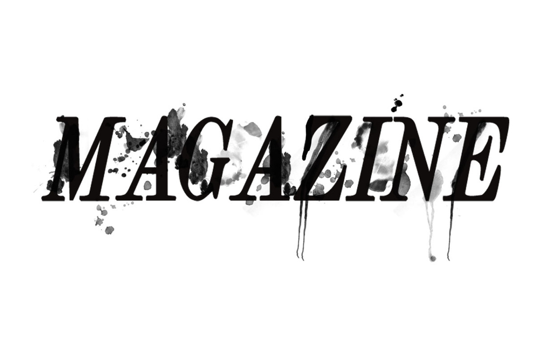
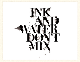
I created this image on Photoshop. I wrote out the word 'MAGAZINE', and set the colour of the font to a black.
I downloaded some ink brushes off the internet and loaded them up to Photoshop. I made sure that the longer splats went with the long letters like 'E'. I also made sure that some splats didn't overlap each other much so that you can't see the first splat put down. I also had to put some around the letters to make it look more interesting. I am really happy with this sample as I think that it looks really different and interesting.
I downloaded some ink brushes off the internet and loaded them up to Photoshop. I made sure that the longer splats went with the long letters like 'E'. I also made sure that some splats didn't overlap each other much so that you can't see the first splat put down. I also had to put some around the letters to make it look more interesting. I am really happy with this sample as I think that it looks really different and interesting.
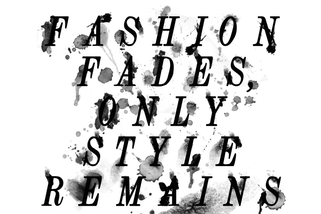
I created this image on Photoshop. I wrote out the quote 'Fashion Fades, only Style Remains', and set the colour of the font to a black.
I downloaded some ink brushes off the internet and loaded them up to Photoshop. I made sure that the longer splats went with the long letters like 'F'. I also made sure that some splats didn't overlap each other much so that you can't see the first splat put down. I also had to put some around the letters to make it look more interesting. I am really happy with this sample as I think that it looks really different and interesting.
I downloaded some ink brushes off the internet and loaded them up to Photoshop. I made sure that the longer splats went with the long letters like 'F'. I also made sure that some splats didn't overlap each other much so that you can't see the first splat put down. I also had to put some around the letters to make it look more interesting. I am really happy with this sample as I think that it looks really different and interesting.
Using downloaded typography presets on After Effects:
I went to a website called animography.net and I found an interesting font called: typogami.
I downloaded it and opened up in After Effects, and watched the tutorial to know exactly how this font can be used.
To use this font, I opened up a new composition and, went through the Characters list and chose the letters I needed. I then selected all the letters and resized them to fit within the composition. I then went to the animation tab, went to key assistant and chose the sequence layers. I put 00:59:15 so that the sequence was nicely put in order and would work correctly. I then exported my outcome.
