Font:
I am listing different types of fonts which I like and/or what might go well with my Harry Potter: The Tale of The Three Brothers animation. I will also enlist some images of what they look like with a few sentences from the script in which Emma Watson is narrating.
DaFont:
This website is especially for getting fonts for either publishing, advertising, photographs and animations, I will be getting most of my fonts from this website as you only have to download them and install them, then you have them in your computer.
This website is especially for getting fonts for either publishing, advertising, photographs and animations, I will be getting most of my fonts from this website as you only have to download them and install them, then you have them in your computer.
Calligraphy Fonts:
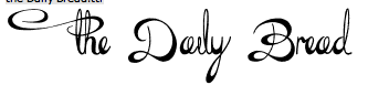
This font is called 'The Daily Bread'.
I rather like this particular font, it is quite subtle yet it has a hint of elegance within it which is rather nice and I think this font could work really well for the animation. This was found on: DaFont The Daily Bread 
This font is called 'Ruritania'
This particular font has again, quite a lot of flourishes which looks rather nice and quite gothic. I really think that again this would look rather well some different words as it would give it that feel of darkness, which I would want for this animation. This was found on: DaFont Ruritania 
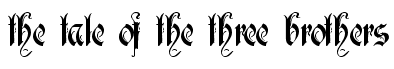
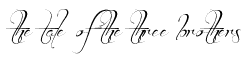
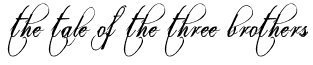
This is called 'Brother Tattoo'
I really like this type of font, it is simple yet it has a flamboyant feel to it as well. If I used this in my animation it would be for the Title sequence as I think it would work rather well, and it will tie in with the theme which goes on throughout the animation. This was found on: DaFont Brother Tattoo 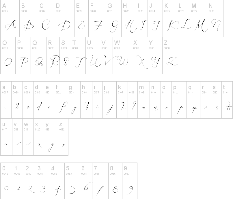
|
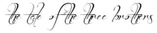
This font is called 'Lydia Puente'.
I quite like this font, as it has little bits of flourishing which is rather nice and it would work for certain words like 'Death' I think that a nice flourished 'D' would look rather nice in this animation. This was found on: DaFont Lydia Puente 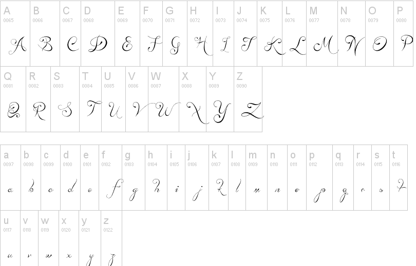
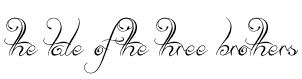
This is called 'Before the Rain'
This is again, another flourished, calligraphy type font which would look rather well for this animation, I would maybe use this, again for certain words depending on the strength it gives off. This was found on: DaFont Before The Rain. 
This is called 'Eutemia'
I think this font is rather interesting and has really nice flourishes. I think that this would go really well for the title sequence for the beginning of the whole animation, or I could use it for the end. This was found on: DaFont Eutemia 
|
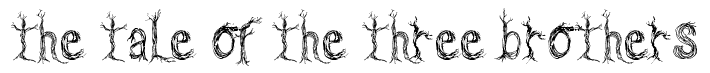
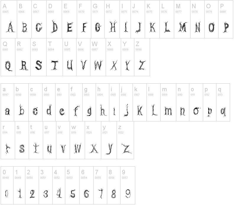
This is called 'CF One Two Trees'
I really like this type of font, it has a really dark and quirky feel towards it, I preferably like the use of trees within this fony. If I used this in my animation it would be for the Title sequence as I think it would work rather well, and it will tie in with the theme which goes on throughout the animation.
This was found on: DaFont
CF One Two Trees
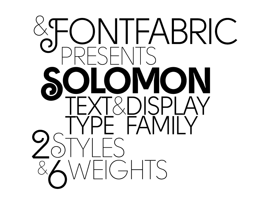
This is an image of the font 'Solomon'.
I quite like this font as of the flourishes within it seem quite poetic and rather well based however, I don't think it would fit in well with my animation. This was found on: 40 Best Fonts For Better Typography |
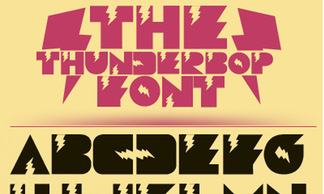
This font is called 'The Thunderbop Font'.
I particularly like this font, I think that the lightning bolts within the font would make for the Harry Potter theme, however again I think it's too over the top for my animation, which needs to be subtle but with elegance. This was found on: 40 Best Fonts For Better Typography |
