Typefaces:
Here I have done some research into typefaces, created my own and criticised some typefaces which I have seen online
Research into typefaces:
Typographic design is one of the fields in design that is usually taken for granted. Many designers just choose a cool font and away they go.
Lacking an understanding of the subject as a whole, some see it as the designing of typefaces, whilst others see it as being closely related to the printing industry or print design. Some just see it as fonts. Well, it's all of those things and more.
Typography is a core building block for brands. Companies such as Microsoft, Audi and the BBC are instantly recognisable, in part due to their typography. This is one of the interesting things about typography on the web. We cannot guarantee the fonts that are installed on a user's machine, therefore, we can't rely on bespoke fonts, or specific brand typefaces, in order to convey a brand.
This is where a good understanding of the craft of typographic design can make all the difference. When we first look at typefaces, only the most dramatic differences are apparent. With our lack of experience, we could see the difference between serif and sans–serif, but had no clue which typefaces were good and which were not. Someone more experienced would come along and completely transform a dull page into a work of clarity and beauty just by changing the typeface.
Anatomy of the typeface:
Typefaces, like other elements of design, such as colour and imagery, communicate. They have defining characteristics that give them personalities.
A good designer would be aware of the different characteristics of typefaces and match those characteristics with the story that they are trying to tell. The characteristics of type can be broadly categorised, as we'll see in the following section, based on some of their main design elements.
A good designer would be aware of the different characteristics of typefaces and match those characteristics with the story that they are trying to tell. The characteristics of type can be broadly categorised, as we'll see in the following section, based on some of their main design elements.
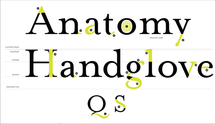
1 Tail
2 Spine
3 Apex
4 Serif
5 Bowl
6 Finial
7 Counter
8 Descender
9 Stem
10 Spur
11 Link
12 Loop
13 Ear
14 Ascender
15 Arm
16 crossbar
2 Spine
3 Apex
4 Serif
5 Bowl
6 Finial
7 Counter
8 Descender
9 Stem
10 Spur
11 Link
12 Loop
13 Ear
14 Ascender
15 Arm
16 crossbar
My own typeface, which I have created:
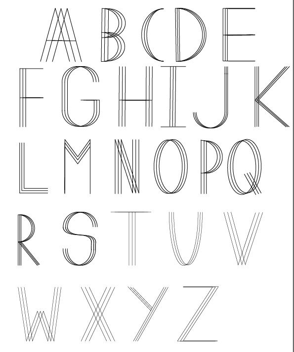
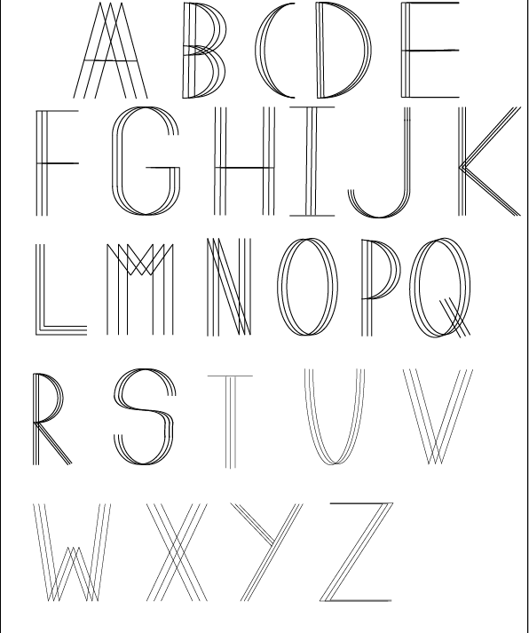
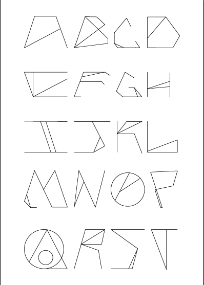
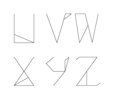
This was my first go at creating a typeface I didn't really like this as the 'M' didn't really follow the rule as the 'A' does. So the image opposite was a recreation of this, by following the rule. I think that the second image looks much better. I also think, that this was really interesting for my first try at creating my own typeface.
|
|
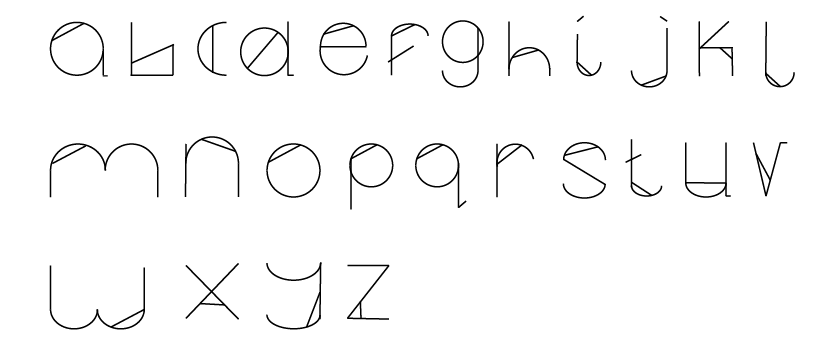
This was my second attempt as a typeface. I decided to create a lowercase typeface as it is different to my first one as that was capitals. I'm quite happy with the way I created this. This was created in illustrator using the tablet and line tool, I also used the circle to create the perfect 'o' shape and also for my 'a', 'd', 'g'. 'p', and 'q'. To create the 'e' I used a half circle, in the beginning I found it quite hard to do, then once I got the hang of it, I thought that it was really easy.
|
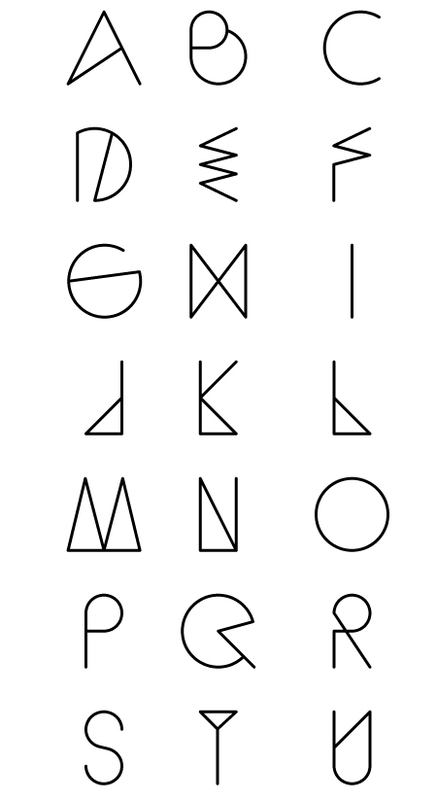
These two images above are my third typeface. I looked on behance under 'typeface' and saw a good few examples which I will go into detail with. I did get some of the basic shapes from the one I looked at to help with creating this typeface. I am really impressed with this one, as I think that it looks really futuristic.
|
Looking at other typefaces:
|
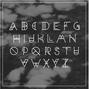
I looked on behance, under 'typefaces' and I came across this one. The title for this typeface is 'Insomniak' from Studiosap. I really like this this typeface, as I think that it looks futuristic and has an interesting feel towards the letters. I have also looked at some of their other works on Behance, and they're really nice and interesting,
|
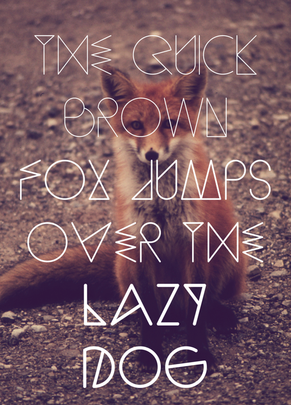
This typeface below, was also found on Behance, the title for this particular one is called Sequi. The owner of this font is: and I have linked that to his behance page. I think that this font is also really interesting and quite quirky too. I also liked the way that the text uses the message with the photograph, which is really interesting and different.
|
